
Drawing the human figure doesn’t just come down to talent, it also comes down to knowing some match and proportional knowledge. This tutorial is full of guidelines that you should save or memorize and use in all of your future artwork that contains people. The human figure is a mathematically beautiful piece of art in itself, find out what you can do to draw people in the correct proportions. This is a blurb from the book “Figure Drawing For All It’s Worth”…you can find it on Amazon if you like this.
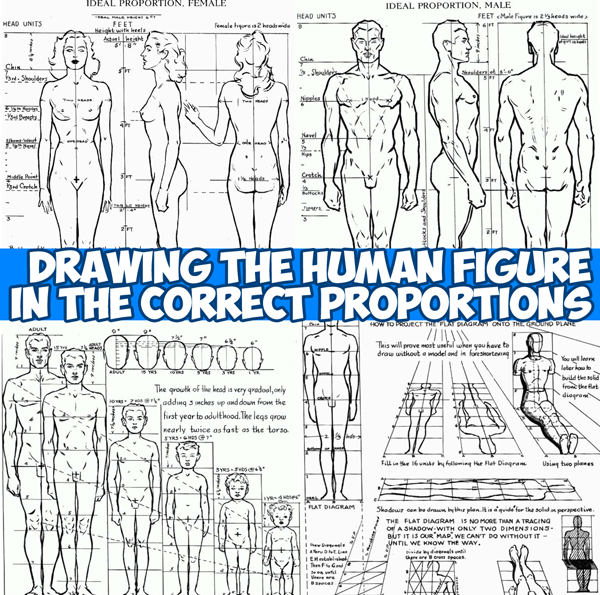
Take any desired height, or place points for the top of head and heels. Divide into eighths. Two and one third of these units will be the relative width for the male figure. It is not necessary at this stage to attempt to render the anatomy correctly. But fix in your mind the divisions. Draw the figure in the three positions: front, side, and back. Note the comparative widths at shoulders, hips, and calves. Note that the space between nipples is one head unit. The waist is a little wider than one head unit. The wrist drops just below the crotch. The elbows are about on a line with the navel. The knees are just above the lower quarter of the figure. The shoulders are one-sixth of the way down. The proportions are also given in feet so that you may accurately relate your figure to furniture and interiors.
[ad#draw]
The female figure is relatively narrower- two heads at the widest point. The nipples are slightly lower than in the male. The waistline measures one head unit across. In front the thighs are slightly wider than the armpits, narrower in back. It is optional whether or not you draw the legs even a little longer from the knees down. Wrists are even with crotch. Five feet eight inches (in heels) is considered an ideal height for a girl. Actually, of course, the average girl has shorter legs and somewhat heavier thighs. Note carefully that the female navel is below the waistline; the male, above or even with it. The nipples and navel are one head apart, but both are dropped below the head divisions. The elbow is above the navel. It is important that you learn the variations between the male and female figure.
You can see at a glance why the actual or normal proportions arc not very satisfactory. All academic drawings based on normal proportions have this dumpy, old-fashioned look. Most fashion artists stretch the figure even beyond eight heads, and in allegorical or heroic figures the “superhuman” type – nine heads – may be used effectively. Note at what point, or head unit, the middle of the figure falls in each. It would be well to draw the side and hack in these various proportions, using the previous page for a general guide but changing the proportion. You can control the appearance of height or shortness in any figure by the relative size of the head you use.
These proportions have been worked out with a great deal of effort and, as far as I know, have never before been put down for the artist. The scale assumes that the child will grow to be an ideal adult of eight head units. If, for instance, you want to draw a man or a woman (about half a head shorter than you would draw the man) with a five-year-old boy, you have here his relative height. Children under ten are made a little shorter and chubbier than normal. since this effect is considered more desirable; those over ten, a little taller than normal – for the same reason.
Technorati Tags: human proportion, human figure, figure drawing, proportions figure drawing, correct human proportion, drawing humans, drawing people, drawing human figure
Today, I'll show you how to draw a cartoon girl pointing at herself with step-by-step…
Today, I'll show you how to draw a crying cute little cartoon guy who is…
Today, I'll show you how to draw an adorably super-cute cartoon owl on a witch's…
Today I will show you how to draw a super cute baby-version of Winnie The…
Today I'll show you how to draw the famous Pusheen cat from social media, such…
Today I'll show you how to draw this super cute chibi version of Deadpool from…
View Comments
impressive. thanx.
Helpful
Big thanks
Helpful drawing for fine arts students .