::::::::::::::::::::::::::::::::::::::::::::::::::::::::::
Space
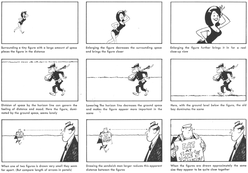
Just as shapes are important to a picture, so is the relationship of space to these shapes. Space is used to show the distance between objects on a Has surface and, more important, to create an illusion of distance. The proper use of space around your figures gives an illusion of depth and also contributes to the mood of the picture.
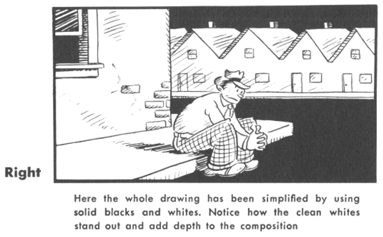
Solid white and solid black
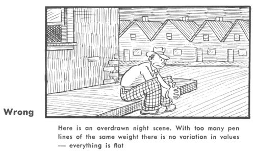
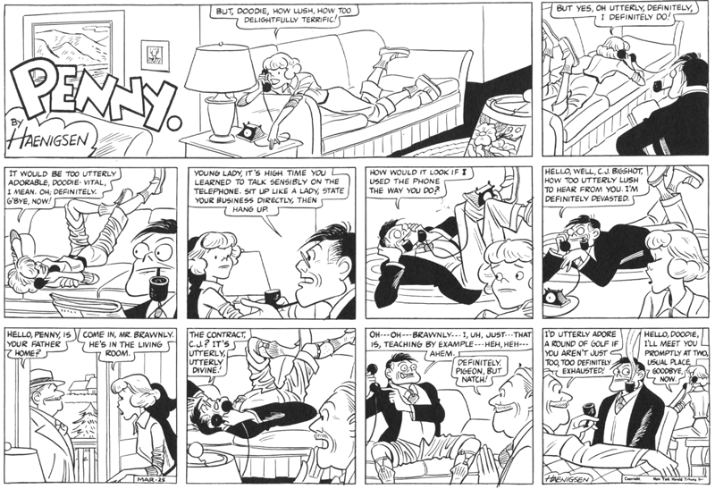
Present-day comic strips are printed so small that it pays to think twice before putting any of that grand old pen shading in your work. It’s apt to close up and look like hair — and hair doesn’t grow on chairs or doorknobs.
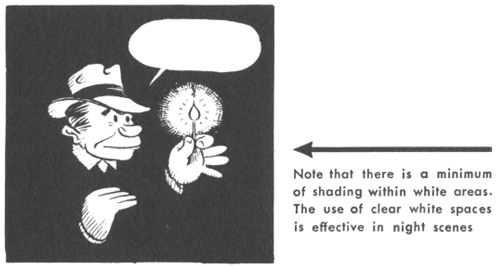
Always be alert for chances to simplify your work into solid whites and blacks. For an object to stand out in a composition it must contrast in value with the surrounding area. Solid black is a great eye-catcher, but over-use makes it tiresome. Clean white space is just as powerful. When you draw solid whites and blacks, keep the outlines sharp and clear-cut so that the shapes are easily recognized. Over-shading can ruin your outlines —avoid it.
Laying Out Comic Strip Panels
::::::::::::::::::::::::::::::::::::::::::::::::::::::::::
CLICK BELOW TO GO TO THE NEXT PAGE : DRAWING CARTOONS FOR THE SUNDAY PAPER



Can you tell me the proportions (in Cm) for drawing a daily weekday newspaper comic strip? (Also the bigger Sunday strip)
I don’t know what to do it on???
You might want to buy a large drawing pad, that is what I used to use.