
Page : 1 2
Good composition in a comic picture means that certain rules have been observed to make the finished effect harmonious and pleasing. When one item in a picture stands out it becomes the central point of interest, so be careful that nothing else conflicts with the element you wish to make more important. Read and study the following comic strip layout and composition instructions lesson to find out how to draw pleasing comics & pages & comic panels.
Here Are Even More Comics / Comic Strips Drawing Tutorials
Comic Page / Panel / Strip Layout and Composition Drawing Tutorial
In the examples below, you will notice how the principal character stands out in some way, either by its unique tone or its relation to the other subjects or characters in the comic panel. Where two characters or subjects are of equal importance, there should be some sort of connection between them, as in the case of the man looking at the sign (pictured below).
It is wise to practice groupings until you have found a comic panel that you are pleased with. Make dozens of small thumbnail sketches before you decide. Any arrangement which best tells your story will be a good composition. There are no set rules as to what constitutes good composition.
This picture has one central point of interest – the boy.
The illustration above, shows a small figure as the central point of interest can be made to stand out although surrounded by other figures.
This is a comic strip panel with the central figure being a black silhouette against a light / white background.
In the above comic strip panel, you can see that the central character is a light / white figure against a dark / black background.
Here is a comic panel in which there are 2 parts that are of equal importance, the top of the man and the road sign.
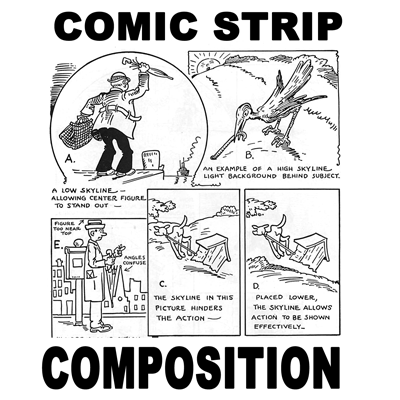
Use care when deciding where to place the skyline. This is not always a horizon line, but the visible outline of the earth or objects seen in the extreme distance. In example A the skyline is low while in example B it is high, and in both cases the important comic figure stands out. If not placed properly, a skyline can hurt the story that you are trying to tell and the action that you are trying to portray, as in C. However, when the skyline is placed low as in example D, nothing stands in the way of the action effects.
Another example of composition is shown when the background is confused with the central comic character. Also, we provide a way to fix this when the issue arises. Try placing a cartoon character of your own against a background of your choice. Check your composition against the illustrations given here. If something seems wrong, see if you can find out what it is.
Page : 1 2
Page: 1 2
Today, I'll show you how to draw a cartoon girl pointing at herself with step-by-step…
Today, I'll show you how to draw a crying cute little cartoon guy who is…
Today, I'll show you how to draw an adorably super-cute cartoon owl on a witch's…
Today I will show you how to draw a super cute baby-version of Winnie The…
Today I'll show you how to draw the famous Pusheen cat from social media, such…
Today I'll show you how to draw this super cute chibi version of Deadpool from…
View Comments
Excellent! Very informative information about comic art.