
Lettering is a distinct art.
HEADINGS AND LETTERING : With Alphabets for Study
The newspaper artist must have a good working knowledge of lettering, for often he is called upon to make headings that will be frequently used, that cover a considerable continuous period, and that therefore must be well lettered. Headings such as I refer to are used on the sport page, for the theater lay-out, for the society and comic columns, weather heading, etc. The staff artist with a paper that publishes a Sunday edition must possess special skill at lettering. The beginner on the staff usually gets this end of the art work, as it is easier than illustrating or drawing cartoons.
Lettering is a distinct art.
Lettering is easily learned. Herewith are reproduced a few stock sets of alphabets (capitals and lower-case) in various faces of type — there are, as you know, many different faces. Copy these alphabets on common scrap paper. Remember the various features of the letters in each face. Practice drawing these letters from memory. Soon you will know enough of the principles of lettering to create your own individual types and forms in headings and designs.
You can obtain other sets of alphabets and thus increase your knowledge of letters by copying them. You will find many good examples in the newspapers and magazines.
Let us -assume you have a heading to draw for the theatrical column. The text is invariably supplied by the dramatic editor. He asks for a two-column head, an inch in depth. As a rule you roughly design a few headings on copy paper and submit the designs to him. He approves of one and you draw it up. The same procedure is followed in making headings for the various other departments of the newspaper.
You should, of course, have a fair idea of composition and a bit of imagination to create a heading. Your letters should balance with the rest of the design. That is, you should not make the letters so heavy that they will appear coarse, nor should they be so thin as to be lost on the page. The heading should be somewhat prominent, for it calls attention to an important column of reading matter. It should be made of letters that are easily read — not jumbled together, nor of a design that makes a "G" appear to be a "C," and vice versa.
When a figure or a small sketch relative to the subject of the heading is added, you must consider the importance of the drawing in relation to the text in judging the relative proportion and comparative prominence to be given each. Usually the text should be made the more prominent. The sketch should simply tell what the heading infers. If there are any other illustrations desired to liven up or graphically describe points in the story, special drawings, separate from the heading, should be made.
For a baseball heading a figure sketch of one or more players in action can be designed with the heading. For a boxing column, show two boxers sparring, or just a pair of boxing gloves. For a racing heading use a horse's head, or a saddle and trappings, or a small racing scene


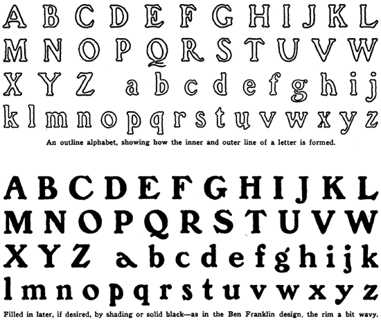

Study and copy each of these sets of alphabets two or three times and you will have mastered the forms of a practical variety of lettering which will enable you to quickly and correctly depict similar lettering. Also this training will enable you to better create your own forms, designs in making headings and creating other lettering requirements. You will find it the simplest means of learning to do lettering.