
DRAWING GROUPS OF OBJECTS


Having blocked in the group, the next thought must be how to finish it so that it may best tell its story. The rendering of a group of objects — that is, the quality and variety of line used —should be such as to suggest the leading ideas of a group. Therefore, in completing any drawing, keep in mind the whole thought which is to be expressed, and aim to express as far as possible by the rendering, the same ideas that were specially considered in the arrangement of the group.
It is necessary that one object should be more noticeable than others, in order to have the eye at once attracted. The principal object in a picture may not he consciously observed first, but the eye finds there a resting-place ; if, on the contrary, there are two or three objects equally prominent, the eye is distracted, and the attention wanders. The principal object should be drawn in such a way as to attract the eye at once.
One object alone is not so interesting as a group of objects ; for an agreeable element of contrast is added by means of the relation of other objects to the principal object. As they are subordinate to the principal object, they should be rendered by lines not as strong and not as definite as those of the principal object.
The effect of distance into the picture, obtained by the placing of some of the objects farther back than others, must be expressed in the rendering by making the lines for the farther objects somewhat lighter and less definite than those of the principal and nearer objects. By the addition of a background, there will be in such an arrangement, foreground, middle distance, background.
In addition to the expression of distance, an emphasis on the side of the objects opposite the light, to suggest shade, will also add to the effect. If the light comes from the left, —as it should in every schoolroom, —the right side of the objects would be in shade, and hence the right side should be emphasized. But the light comes from above also, so that the lower part may also be strengthened. These dark lines suggest shade, but they also suggest light ; for there would be neither shade nor shadow were it not for the light. So the touches for shade really introduce the thought of light into the group.
Still further the shade and shadow may be expressed by lines, varying according to the degree of shade and shadow, as illustrated in the Drawing-Books, and on Plates II and III.
Look at any object placed in the light; the part toward the light is of a different tone from the part away from the light and the object casts a shadow. We have, then, light on the part toward the light, shade on the part away from the light, and the shadow cast by the object — three distinct conditions as regards the light.These conditions, generally included under the term light and shade, are to be studied in this exercise.
When the light comes but from one part of the room, the light on the object is strong, the shade and shadow are well defined. If light comes from two or more directions, there will be cross lights, which will cause perhaps two or three shadows mingling with each other, and render the limits of shade and shadow vague. In any elementary study of light and shade, therefore, the light should be arranged as fai as possible to fall in one direction.
The best effects can be obtained in a schoolroom where the light comes in from the side alone.* If the room is lighted from one side and the back, shut off the light from the back and from all but one or two windows at the side. If the lower part of these windows can be screened, it will be better. In the case of cross lights, only the strongest shades and shadows should be studied.
Even more care is necessary in the arrangenimt and placing of objects for study of light and shade effects than for mere outline drawing. A group of two or more models affords more variety and contrast than if but one model is taken. Suppose the sphere and cylinder to be chosen. Lead the pupils to discover that the sphere slightly in front of the cylinder makes a more agreeable arrangement than beside or behind the cylinder. To keep the spheres stationary, place them on tiny brass or rubber rings, which may be bought by the box, and distributed and collected with the models.
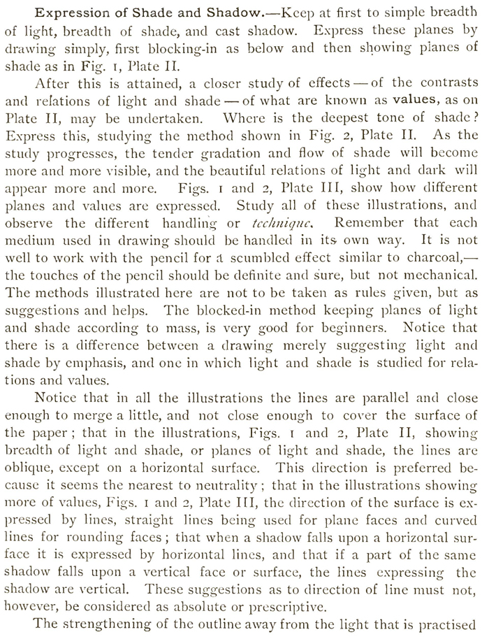
If the teacher, in preparing for this lesson, will work at a pupil's desk, any peculiarities in the situation will become apparent. Observe the general form of the whole group—the proportion of one model to the other. Sketch lightly, but carefully, the cylinder and sphere. Half close the eyes, and look carefully at the shade upon the models and the shadows cast by each model upon the paper. You will see what artists call the breadth of light and the breadth of shade on the models —that is to say, the light side as a whole, and the dark side as a whole. Still "looking through the eyelashes," see how far the breadth of shade extends upon the cylinder, upon the sphere —the shape of the shade. See the illustration on page 21. With a line so faint that it will not be observed when the shade is expressed, sketch on the drawing of the cylinder, the blocking-in of the limit or outline of the shade— the same upon the sphere. Study the cast shadows most carefully as to
they often fall in a most unexpected way. The foreshortening on a horizontal surface must not be forgotten, and the absolute change of general direction when continued on a vertical surface. Notice the shape of the cast shadow of the cylinder, of the sphere, and that the shadow of the sphere may run up on the cylinder. Block in very lightly the outlines of the shadows wherever they fall. It must be borne in mind that the shades and shadows will be different for each pupil. Each one must study for himself. Those in the front seats may get the light a little over the shoulder, so that their shades and shadows will not be like those for whom the light falls more directly.
Now give careful study to the relative tones of the light, shade, and cast shadow. Which is lightest? Which is darkest? Which is the middle tone? Cast shadows are always slightly darker than the shade upon objects. Look at various objects upon which the light falls from one direction for examples.
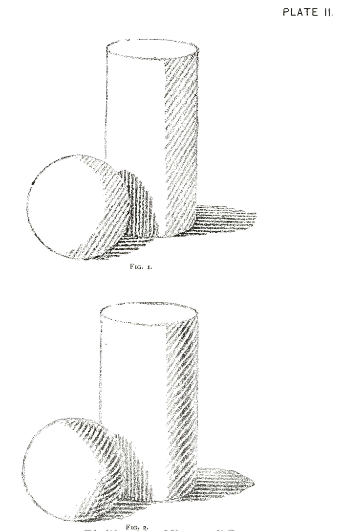
Keep at first to simple breadth of light, breadth of shade, and cast shadow. Express these planes by drawing simply, first blocking-in as below and then showing planes of shade as in Fig. 1, Plate II.
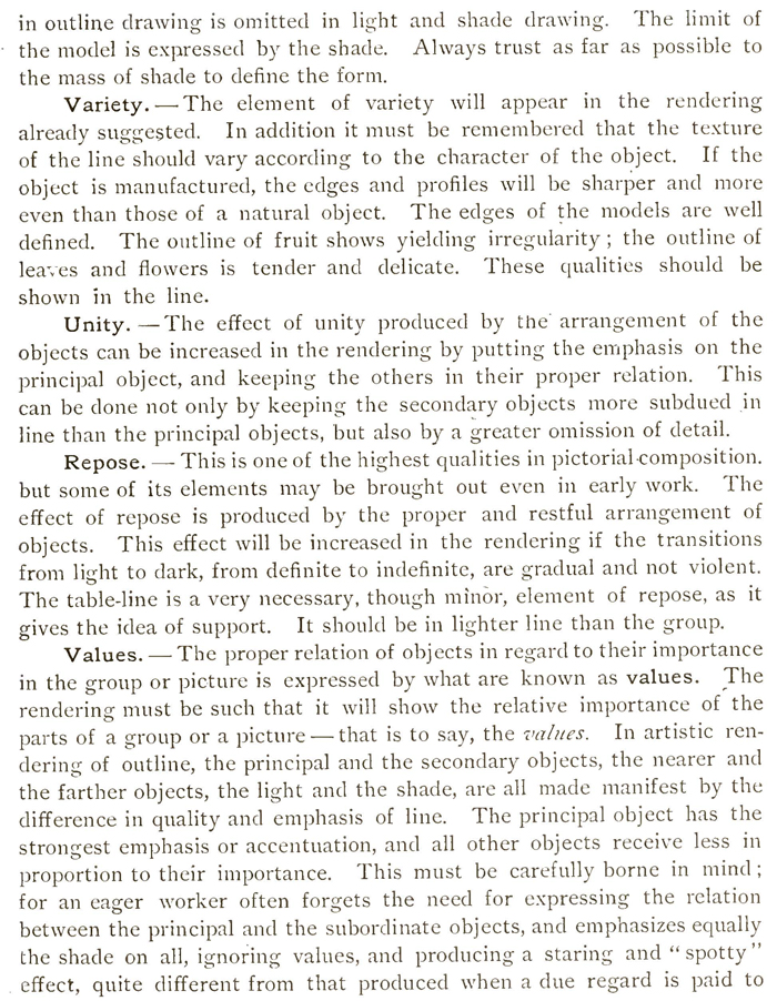
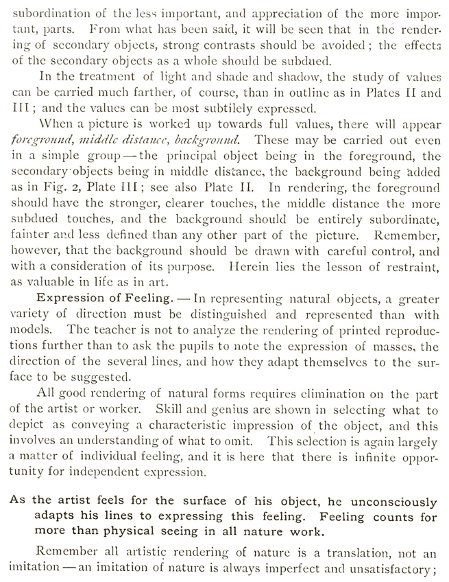
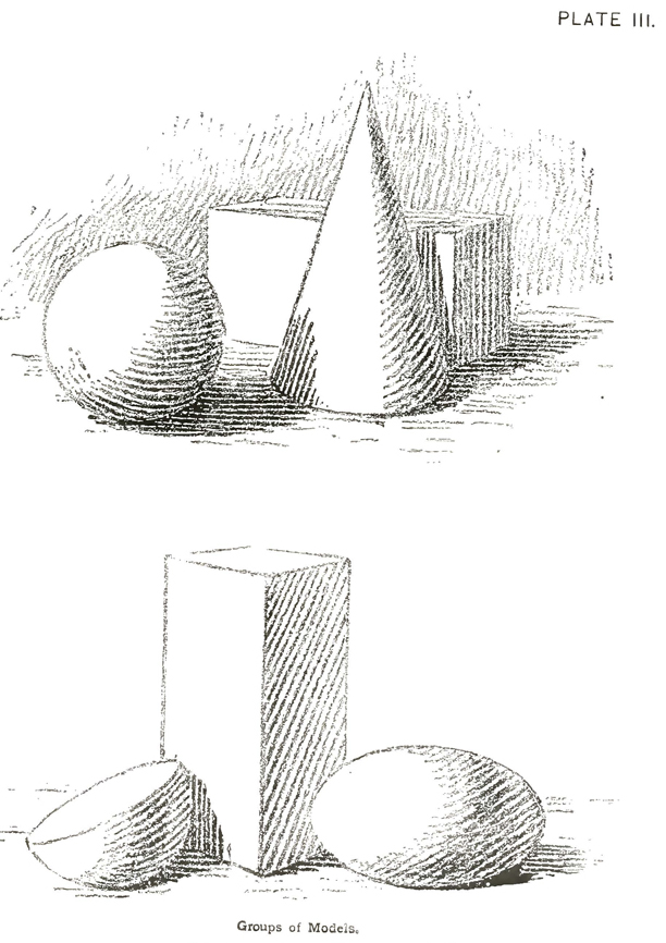
After this is attained, a closer study of effects — of the contrasts and relations of light and shade — of what are known as values, as on Plate II, may be undertaken. Where is the deepest tone of shade? Express this, studying the method shown in Fig. 2, Plate II. As the study progresses, the tender gradation and flow of shade will become more and more visible, and the beautiful relations of light and dark will appear more and more. Figs. t and 2, Plate III, show how different planes and values are expressed. Study all of these illustrations, and observe the different handling or technique. Remember that each medium used in drawing should be handled in its own way. It is not well to work with the pencil for a scumbled effect similar to charcoal,—the touches of the pencil should be definite and sure, but not mechanical. The methods illustrated here are not to be taken as rules given, but as suggestions and helps. The blocked-in method keeping planes of light and shade according to mass, is very good for beginners. Notice that there is a difference between a drawing merely suggesting light and shade by emphasis, and one in which light and shade is studied for relations and values.
Notice that in all the illustrations the lines are parallel and close enough to merge a little, and not close enough to cover the surface of the paper ; that in the illustrations, Figs. i and 2, Plate II, showing breadth of light and shade, or planes of light and shade, the lines are oblique, except on a horizontal surface. This direction is preferred because it seems the nearest to neutrality ; that in the illustrations showing more of values, Figs. t and 2, Plate III, the direction of the surface is expressed by lines, straight lines being used for plane faces and curved lines for rounding faces ; that when a shadow falls upon a horizontal surface it is expressed by horizontal lines, and that if a part of the same shadow falls upon a vertical face or surface, the lines expressing the shadow are vertical. These suggestions as to direction of line must not, however, be considered as absolute or prescriptive.
The strengthening of the outline away from the light that is practised in outline drawing is omitted in light and shade drawing. The limit of the model is expressed by the shade. Always trust as far as possible to the mass of shade to define the form.
The element of variety will appear in the rendering already suggested. In addition it must be remembered that the texture of the line should vary according to the character of the object. If the object is manufactured, the edges and profiles will be sharper and more even than those of a natural object. The edges of the models are well defined. The outline of fruit shows yielding irregularity ; the outline of leaves and flowers is tender and delicate. These qualities should be shown in the line.
The effect of unity produced by the. arrangement of the objects can be increased in the rendering by putting the emphasis on the principal object, and keeping the others in their proper relation. This can be done not only by keeping the secondary objects more subdued in line than the principal objects, but also by a greater omission of detail.
This is one of the highest qualities in pictorial•composition. but some of its elements may be brought out even in early work. The effect of repose is produced by the proper and restful arrangement of objects. This effect will be increased in the rendering if the transitions from light to dark, from definite to indefinite, are gradual and not violent. The table-line is a very necessary, though minimal, element of repose, as it gives the idea of support. It should be in lighter line than the group.
The proper relation of objects in regard to their importance in the group or picture is expressed by what are known as values. The rendering must be such that it will show the relative importance of the parts of a group or a picture — that is to say, the values. In artistic rendering of outline, the principal and the secondary objects, the nearer and the farther objects, the light and the shade, are all made manifest by the difference in quality and emphasis of line. The principal object has the strongest emphasis or accentuation, and all other objects receive less in proportion to their importance. This must be carefully borne in mind ; for an eager worker often forgets the need for expressing the relation between the principal and the subordinate objects, and emphasizes equally the shade on all, ignoring values, and producing a staring and " spotty" effect, quite different from that produced when a due regard is paid to subordination of the less important, and appreciation of the more impor- tant, parts. From what has been said, it will be seen that in the rendering of secondary objects, strong contrasts should be avoided ; the effects of the secondary objects as a whole should be subdued.
In the treatment of light and shade and shadow, the study of values can be carried much farther, of course, than in outline as in Plates II and III ; and the values can be most subtilely expressed.
When a picture is worked up towards full values, there will appear foreground, middle distance, background. These may be carried out even in a simple group—the principal object being in the foreground, the secondary-objects being in middle distance, the background being added as in Fig. 2, Plate HI ; see also Plate II. In rendering, the foreground should have the stronger, clearer touches, the middle distance the more subdued touches, and the background should be entirely subordinate, fainter and less defined than any other part of the picture. Remember, however, that the background should be drawn with careful control, and with a consideration of its purpose. Herein lies the lesson of restraint, as valuable in life as in art.
In representing natural objects, a greater variety of direction must be distinguished and represented than with models. The teacher is not to analyze the rendering of printed reproductions further than to ask the pupils to note the expression of masses, the direction of the several lines, and how they adapt themselves to the surface to be suggested.
All good rendering of natural forms requires elimination on the part of the artist or worker. Skill and genius are shown in selecting what to depict as conveying a characteristic impression of the object, and this involves an understanding of what to omit, This selection is again largely a matter of individual feeling, and it is here that there is infinite opportunity for independent expression.
As the artist feels for the surface of his object, he unconsciously adapts his lines to expressing this feeling. Feeling counts for more than physical seeing in all nature work.
Remember all artistic rendering of nature is a translation, not an imitation—an imitation of nature is always imperfect and unsatisfactory; in seeking for realistic details the spirit is sacrificed. The truth of realism must always he partial and one-sided if it starts on the basis that the physical senses are the measure of the human soul. The truth of idealism is the all-embracing truth of art, and that to which it is consecrated.